Dining Room Wall Colors: Creating the Perfect Ambiance
The dining room serves as more than just a space for eating; it is a gathering place for family and friends, a venue for celebrations, and a backdrop for creating lasting memories. Consequently, selecting the right wall color is paramount to establishing the desired ambiance and enhancing the overall dining experience. The color chosen for the dining room walls can influence mood, appetite, and the perception of the space itself. Therefore, careful consideration should be given to the various color options and their respective effects.
This article provides a detailed exploration of dining room wall color ideas, offering insights and guidance to assist in creating a space that is both aesthetically pleasing and conducive to enjoyable dining experiences. Factors such as room size, lighting conditions, personal style, and the intended purpose of the dining room will be addressed, offering a comprehensive understanding of how to choose the optimal color palette.
Understanding the Psychology of Color in the Dining Room
Colors are known to evoke different emotions and influence behavior. When selecting a wall color for the dining room, it is crucial to consider the psychological impact of each hue. Warm colors, such as reds, oranges, and yellows, are often associated with energy, excitement, and appetite stimulation. Cool colors, like blues, greens, and purples, tend to create a more relaxed and calming atmosphere. By understanding the psychological effects of different colors, one can make a more informed decision about which palette best suits the desired dining room atmosphere.
Red, for example, is a bold and stimulating color often used to create a sense of passion and excitement. In the dining room, red can be used to enhance the appetite and encourage lively conversation. However, it is important to use red sparingly, as it can be overwhelming if used excessively. A single accent wall or strategically placed red décor can provide the desired effect without overpowering the space. Lighter shades of red, such as coral and rose, offer a softer and more inviting alternative.
Orange is another warm color that is associated with energy and enthusiasm. It is a more approachable and cheerful color than red, making it a good option for a family dining room. Orange can create a sense of warmth and comfort, making it a welcoming space for both family meals and casual gatherings. Like red, it is best used in moderation or in lighter shades, such as peach or apricot.
Yellow is a bright and optimistic color that can bring a sense of sunshine and happiness to the dining room. It is a good choice for spaces that lack natural light, as it can brighten up the room and create a more cheerful atmosphere. However, yellow can also be overwhelming if used excessively. Softer shades of yellow, such as cream or butter, are often preferred for dining room walls.
Cool colors, such as blue and green, can create a more serene and calming atmosphere in the dining room. Blue is often associated with tranquility and relaxation, making it a good choice for formal dining rooms or spaces where one wants to create a sense of peace and quiet. However, blue can also be a bit cool and uninviting if not balanced with warmer tones. Green is a more versatile cool color that can be used to create a variety of different moods. It is often associated with nature and freshness, making it a good choice for a dining room that overlooks a garden or other outdoor space.
Purple is a color that is often associated with luxury and sophistication. It can be used to create a dramatic and elegant atmosphere in the dining room. However, purple can also be a bit overwhelming if used excessively. Lighter shades of purple, such as lavender or lilac, are often preferred for dining room walls.
Considering Room Size, Lighting, and Existing Décor
Beyond the psychology of color, several other factors should be considered when selecting dining room wall colors. The size of the room, the amount of natural light, and the existing décor can all influence the choice of the optimal color palette. A small dining room, for example, will benefit from lighter colors that can make the space feel larger and more open. Darker colors, on the other hand, can make a small room feel even smaller and more cramped. However, if one desires to use a darker color, utilizing it on a single accent wall can create a dramatic effect without overwhelming the space.
The amount of natural light in the dining room is another important consideration. Rooms with ample natural light can handle a wider range of colors, including darker shades. However, rooms with limited natural light will benefit from lighter colors that can reflect light and brighten up the space. Artificial lighting can also be used to enhance the color of the walls and create the desired ambiance. Warm-toned lighting can enhance warm colors, while cool-toned lighting can enhance cool colors.
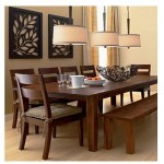
The existing décor in the dining room should also be taken into account when selecting wall colors. The wall color should complement the furniture, flooring, and accessories in the room. For example, if one has dark wood furniture, one might want to choose a lighter wall color to create contrast and prevent the room from feeling too dark. Conversely, if one has light wood furniture, one may opt for a darker wall color to create a more dramatic effect. The color of the flooring should also be considered. Neutral-colored flooring allows for greater flexibility in wall color selection, while bolder flooring choices may require a more carefully curated palette.
Exploring Specific Color Palette Ideas for Dining Rooms
Once the factors mentioned above have been considered, one can begin exploring specific color palette ideas for the dining room. There are countless options to choose from, ranging from classic neutrals to bold and vibrant hues. The key is to find a palette that reflects one's personal style and creates the desired atmosphere.
Neutral Palettes: Neutral colors, such as white, beige, and gray, are a popular choice for dining rooms. They are versatile and can be easily paired with a variety of different furniture and accessories. Neutral colors also create a sense of calm and sophistication, making them a good choice for formal dining rooms. White walls provide a blank canvas that allows artwork and other decorative elements to take center stage. Beige offers a warmer alternative to white, creating a cozy and inviting atmosphere. Gray is a versatile neutral that can range from cool and contemporary to warm and traditional, depending on the shade.
Warm Palettes: Warm color palettes can create a sense of energy and excitement in the dining room. Red, orange, and yellow are all warm colors that can be used to enhance the appetite and encourage lively conversation. These colors can be incorporated as accent walls or through decorative elements to add vibrancy and warmth without overwhelming the space.
Cool Palettes: Cool color palettes can create a more serene and calming atmosphere in the dining room. Blue, green, and purple are all cool colors that can be used to create a sense of peace and quiet. These colors work well in formal dining rooms or spaces where a relaxed and sophisticated ambiance is desired. Soft greens and blues can evoke a sense of nature, while lavender and other light purples can create an elegant and refined atmosphere.
Monochromatic Palettes: A monochromatic color palette involves using different shades and tints of a single color to create a cohesive and sophisticated look. This approach can be particularly effective in a dining room, as it creates a sense of harmony and balance. For example, one could use a light gray on the walls, a medium gray on the trim, and a dark gray on the furniture. This creates a subtle and elegant effect that is both visually appealing and calming.
Complementary Palettes: A complementary color palette involves using two colors that are opposite each other on the color wheel. Examples include blue and orange, red and green, and yellow and purple. This approach can create a bold and dynamic look in the dining room, adding visual interest and excitement. However, it is important to use complementary colors carefully, as they can easily clash if not balanced properly. One color should be dominant, while the other is used as an accent.
Analogous Palettes: An analogous color palette involves using colors that are next to each other on the color wheel. Examples include blue, green, and teal, or red, orange, and yellow. This approach can create a harmonious and visually appealing look in the dining room. Analogous colors are generally easy to work with, as they naturally complement each other.
Ultimately, the best dining room wall color is the one that reflects one's personal style and creates the desired atmosphere. By considering the factors outlined in this article, one can make an informed decision and create a dining room that is both aesthetically pleasing and conducive to enjoyable dining experiences. Experimenting with different color combinations and testing samples in the space is recommended to ensure the chosen palette aligns with personal preferences and the specific characteristics of the room.

8 Beautiful Dining Room Paint Ideas Paintzen
:max_bytes(150000):strip_icc()/MaryPatton_May2020-6-8e9f410c0f1d4fe28484853ea47b1d5c.jpg?strip=all "40 Perfect Dining Room Colors For Any Style")
40 Perfect Dining Room Colors For Any Style

Pick Something Bold For Your Dining Room Paint

The Best Beamin Moore Dining Room Paint Colors

40 Best Dining Room Paint Colors Color Schemes For Rooms

Dining Room Paint Colors To Try Now Clare

Dining Room Inspiration By Farrow Ball

20 Best Dining Room Colours To Consider In 2024

The Best Dining Room Paint Color

The Best Dining Room Paint Color