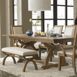
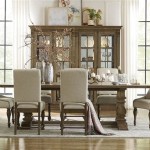
Dining Room with Chair Rail: Exploring Paint Color Options
The dining room serves as a central hub for gatherings, meals, and shared experiences. Its design significantly impacts the overall ambiance and flow of a home. Integrating a chair rail into the dining room's design adds a layer of architectural interest and visual division. This horizontal molding, typically installed at a height of 30-36 inches from the floor, presents a unique opportunity to play with paint colors, creating a dynamic and personalized space. Choosing the right paint colors for above and below the chair rail can dramatically alter the room's perceived size, style, and mood. This article delves into various paint color strategies for dining rooms with chair rails, providing insights for achieving a cohesive and visually appealing aesthetic.
Color selection in a dining room should consider the existing architectural elements, furniture, and lighting conditions. The presence of a chair rail introduces an additional layer of complexity, as the color choices must complement both the upper and lower portions of the wall, as well as the chair rail itself. The chair rail can be painted the same color as the trim, a contrasting color, or even integrated into the upper or lower wall color. Each approach yields a different visual impact.
Understanding Color Psychology and its Application
Color psychology explores the effects of different colors on human emotions and behavior. In the context of a dining room, certain colors can promote relaxation, stimulate appetite, or encourage conversation. Understanding these psychological effects can help in selecting paint colors that align with the desired atmosphere.
Warm colors, such as reds, oranges, and yellows, are often associated with energy, warmth, and appetite stimulation. A dining room painted in a warm hue can feel inviting and convivial. However, it's important to use these colors judiciously, as excessive use can create a sense of unease or overstimulation. For instance, a deep, muted red below the chair rail could provide a grounding effect, while a lighter, complementary shade above can balance the intensity.
Cool colors, such as blues, greens, and purples, evoke feelings of calmness, serenity, and sophistication. A dining room painted in cool tones can feel relaxing and elegant. However, depending on the shade and saturation, cool colors can also feel cold or uninviting. A soft, muted blue above the chair rail can create a sense of airiness, while a darker, complementary green below can anchor the space. Accents of warm colors in the furniture or décor can help to balance the coolness.
Neutral colors, such as whites, grays, beiges, and browns, provide a versatile backdrop that can be paired with a wide range of accent colors. Neutral tones are often used to create a sense of spaciousness and sophistication. A dining room painted in neutral colors can be easily adapted to different styles and preferences. For example, a light gray above and below the chair rail can create a modern and minimalist look, while a warmer beige can evoke a more traditional and cozy feel. The chair rail itself can be painted a crisp white to provide a clean and defined separation between the two wall sections.
Beyond pure color, consider the undertones present in each shade. A gray, for instance, can have blue, green, or even pink undertones. Matching undertones across different paint colors is crucial for achieving a harmonious and cohesive look. Similarly, the finish of the paint can also impact the overall appearance. Matte finishes tend to absorb light and create a softer, more subdued look, while glossy finishes reflect light and create a more vibrant and dramatic effect.
Implementing Color Schemes with the Chair Rail
The chair rail acts as a natural dividing line, offering opportunities for implementing various color schemes. The choice of color scheme depends on the desired visual effect and the overall style of the dining room.
A monochromatic color scheme involves using different shades of the same color. This approach creates a sense of unity and harmony. For example, a dining room could feature a light beige above the chair rail and a darker beige below. The chair rail itself could be painted in a slightly different shade of beige or a complementary neutral color. A monochromatic scheme tends to create a calm and sophisticated atmosphere.
An analogous color scheme involves using colors that are adjacent to each other on the color wheel. This approach creates a sense of visual interest while maintaining a harmonious feel. For example, a dining room could feature a light green above the chair rail and a slightly darker blue-green below. The chair rail could be painted in a neutral color or a shade that complements both green and blue-green. An analogous scheme evokes a sense of nature and tranquility.
A complementary color scheme involves using colors that are opposite each other on the color wheel. This approach creates a striking contrast and adds visual energy. For example, a dining room could feature a light blue above the chair rail and a warm orange below. The chair rail could be painted in a neutral color to balance the contrast. A complementary scheme can be bold and dramatic, but it requires careful planning to avoid creating a jarring effect.
A split-complementary color scheme involves using one color and the two colors adjacent to its complement on the color wheel. This approach provides a less intense contrast than a complementary scheme while still offering visual interest. For example, a dining room could feature a light green above the chair rail and shades of red-orange and red-violet below. The chair rail can be painted in a neutral color or a shade that complements the chosen colors. A split-complementary scheme offers a balanced and sophisticated look.
In addition to these classic color schemes, consider incorporating accent colors through furniture, artwork, and accessories. These accent colors can be used to tie the room together and add personality. For example, a dining room with a neutral color scheme could be accented with pops of vibrant color through cushions, curtains, or artwork.
Specific Color Combinations and Style Considerations
The following are some specific color combinations that work well in dining rooms with chair rails, along with their respective style considerations:
Crisp White Above and Navy Blue Below: This combination is classic, elegant, and timeless. The crisp white above the chair rail creates a sense of spaciousness and airiness, while the navy blue below provides a grounding effect and adds a touch of sophistication. The chair rail can be painted in a crisp white to match the upper wall or a slightly darker shade of blue to create a subtle contrast. This combination works well in traditional, coastal, and transitional dining rooms. Adding brass or gold accents can elevate the look.
Light Gray Above and Dark Charcoal Gray Below: This combination is modern, sophisticated, and versatile. The light gray above the chair rail creates a sense of calm and serenity, while the dark charcoal gray below adds depth and drama. The chair rail can be painted in a lighter shade of gray to create a subtle contrast or a crisp white for a cleaner look. This combination works well in contemporary, minimalist, and industrial dining rooms. Adding metallic accents, such as silver or chrome, can enhance the modern feel.
Pale Yellow Above and Soft Green Below: This combination is cheerful, inviting, and nature-inspired. The pale yellow above the chair rail creates a sense of warmth and optimism, while the soft green below evokes feelings of tranquility and harmony. The chair rail can be painted in a crisp white to provide a clean separation or a lighter shade of green to create a subtle transition. This combination works well in traditional, farmhouse, and cottage-style dining rooms. Adding natural elements, such as wood and plants, can enhance the natural feel.
Cream Above and Burgundy Below: This combination is rich, elegant, and traditional. The cream above the chair rail provides a soft and neutral backdrop, while the burgundy below adds depth and warmth. The chair rail can be painted in the same cream as the upper wall, allowing the burgundy to be the focal point. This combination works well in formal dining rooms with classic furniture and opulent décor.
Light Blue Above and White Below: This combination is airy, refreshing, and coastal-inspired. The light blue above the chair rail evokes feelings of the sky and sea, while the white below creates a sense of cleanliness and simplicity. The chair rail should be painted white to maintain the clean aesthetic. This combination is ideal for creating a relaxing and informal dining atmosphere, especially when paired with natural wood furniture and nautical accents.
Before committing to a specific color combination, it is recommended to test paint samples on the wall. Observe the colors in different lighting conditions to ensure that they achieve the desired effect. Additionally, consider the existing furniture, artwork, and décor when making a final decision. The colors should complement the overall style of the dining room and create a cohesive and inviting space.

How To Make The Most Of Your Chair Rail Delightfully

How To Update Paint A Room With Chair Rail Dado

The 3 Best Paint Choices For Walls With Chair Rails Teresa Flowers
:max_bytes(150000):strip_icc()/katemarkerinteriors-c1d4580c771549508eb0897ef9714c81.jpg?strip=all "24 Stylish Chair Rail Ideas For An Elevated Look In Any Room")
24 Stylish Chair Rail Ideas For An Elevated Look In Any Room

14 Two Tone Color Ideas For Walls With Chair Rails Hunker

Chair Rails In The Dining Room 9 Great Ideas Renocompare

How To Make The Most Of Your Chair Rail Delightfully

Painting Below The Chair Rail Emily A Clark

The Joy Of Choosing Perfect Dining Room Paint Colors

20 Dining Room Ideas With Chair Rail Molding Housely