Best Color For Dining Room Walls
Selecting the optimal color for dining room walls is a multifaceted decision, influenced by factors ranging from personal preference and aesthetic goals to the room's architecture and lighting conditions. The chosen color significantly impacts the perceived ambiance, influencing mood, appetite, and the overall dining experience. A well-considered color palette can transform a dining room from a purely functional space into an inviting and stylish environment.
The art of interior design revolves around creating harmony and balance. Color plays a crucial role in achieving this objective. When considering dining room wall colors, it’s essential to move beyond fleeting trends and focus on creating a space that reflects individual style and serves its intended purpose. This entails understanding color psychology, assessing the room's unique characteristics, and carefully considering how different hues interact with light and other design elements.
Understanding Color Psychology in the Dining Room
Colors elicit specific emotional and psychological responses, a phenomenon known as color psychology. Understanding these responses is vital when selecting a dining room wall color. For instance, warm colors like reds, oranges, and yellows are often associated with energy, excitement, and appetite stimulation, making them potential choices for creating a lively and convivial atmosphere. Conversely, cool colors like blues, greens, and purples are typically linked to calmness, relaxation, and tranquility. These cooler tones may be more suitable for creating a serene and sophisticated dining environment.
Red, while stimulating, can be overwhelming if used excessively. Its intensity can increase heart rate and blood pressure, potentially leading to a feeling of restlessness. Therefore, if considering red, it's best to use it as an accent color or opt for a muted or toned-down shade like terracotta or burgundy. These variations provide warmth and richness without the jarring effect of a brighter red. Oranges convey warmth and sociability, promoting conversation and a sense of community. However, like red, vibrant oranges can be overpowering. Muted oranges, such as peach or apricot, offer a more subtle and inviting alternative.
Yellows, often associated with happiness and optimism, can brighten a dining room and create an uplifting atmosphere. However, certain shades of yellow can be perceived as irritating or agitating, especially in brightly lit spaces. Soft, buttery yellows or creamy off-whites with yellow undertones can deliver the desired warmth without the potential for overstimulation. Greens, symbolizing nature and tranquility, can bring a sense of freshness and balance to a dining room. Different shades of green evoke different feelings. Light, airy greens are refreshing and rejuvenating, while deeper, more saturated greens are grounding and sophisticated.
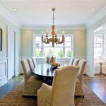
Blues, often chosen for their calming properties, can create a serene and relaxing dining environment. However, it's important to note that blue can sometimes suppress appetite, particularly in darker shades. Lighter, warmer blues, such as aqua or robin's egg blue, are generally more palatable and can create a pleasant and inviting atmosphere. Purples, associated with royalty, creativity, and spirituality, can add a touch of elegance and sophistication to a dining room. Deep purples, like eggplant or plum, are dramatic and luxurious, while lighter purples, like lavender or lilac, are more delicate and romantic.
Assessing the Dining Room's Unique Characteristics
Beyond color psychology, the physical characteristics of the dining room itself play a crucial role in determining the optimal wall color. Factors such as room size, natural light availability, architectural features, and existing furniture and décor must be carefully considered. A small dining room, for example, will benefit from lighter colors that reflect light and create the illusion of spaciousness. Darker colors, while potentially adding drama and intimacy, can make a small room feel cramped and claustrophobic.
Natural light dramatically affects how colors appear. A dining room with ample natural light can accommodate a wider range of colors, including darker shades, without feeling oppressive. However, a dining room with limited natural light will require lighter, brighter colors to maximize the available light and prevent the space from feeling gloomy. Considering the direction of the windows is also important. South-facing windows bring in warm, golden light, which can intensify warm colors. North-facing windows bring in cooler, more diffused light, which can emphasize cool colors.
Architectural features, such as wainscoting, trim, and moldings, can influence color choices. These features can be painted in contrasting colors to create visual interest and highlight the room's architectural details. Alternatively, they can be painted in a similar color to the walls to create a more cohesive and unified look. The style and color of existing furniture and décor must also be taken into account. The wall color should complement the furniture and décor, creating a harmonious and balanced aesthetic. It's advisable to consider the undertones of existing furniture and choose wall colors that share similar undertones for a cohesive look.
Considering Light and Color Interactions
The interaction between light and color is a critical aspect of interior design. Different types of lighting, including natural light, artificial light, and ambient light, can significantly affect how colors are perceived. In addition to natural light, artificial lighting plays a significant role. Incandescent lighting casts a warm, yellowish glow, which can enhance warm colors and subdue cool colors. Fluorescent lighting casts a cool, bluish glow, which can enhance cool colors and subdue warm colors. LED lighting offers a wider range of color temperatures, allowing for greater control over the overall lighting scheme.
Ambient light, or the overall level of illumination in the room, also affects color perception. In a dimly lit dining room, darker colors can appear even darker and more muted, while lighter colors can appear brighter and more vibrant. Conversely, in a brightly lit dining room, darker colors can appear more saturated and intense, while lighter colors can appear washed out. It is beneficial to test paint samples in the dining room under different lighting conditions before making a final decision. This will allow for a more accurate assessment of how the color will appear at different times of the day and under different types of lighting.
The finish of the paint also impacts how light interacts with the color. Matte finishes absorb light, creating a softer, more muted look. Satin finishes reflect some light, creating a subtle sheen. Glossy finishes reflect the most light, creating a dramatic and reflective surface. Matte finishes are generally preferred for dining rooms, as they create a more relaxed and inviting atmosphere. Satin finishes can be used to highlight architectural features or to add a touch of elegance. Glossy finishes are typically not recommended for dining rooms, as they can be too reflective and distracting.
Ultimately, the best color for dining room walls is a subjective decision that depends on individual preferences and the specific characteristics of the space. By understanding color psychology, assessing the room's unique features, and considering light and color interactions, it is possible to create a dining room that is both visually appealing and conducive to a positive dining experience.

The Best Dining Room Paint Color
:max_bytes(150000):strip_icc()/MaryPatton_May2020-6-8e9f410c0f1d4fe28484853ea47b1d5c.jpg?strip=all "40 Perfect Dining Room Colors For Any Style")
40 Perfect Dining Room Colors For Any Style
:strip_icc()/cdn.cliqueinc.com__cache__posts__209952__if-you-do-this-one-thing-you-dont-need-to-redecorate-your-dining-room-1997706-1480544442.700x0c-7744b38e1e3c4806bd6da128e6d789b6.jpg?strip=all "The 12 Best Dining Room Paint Colors")
The 12 Best Dining Room Paint Colors

The Best Beamin Moore Dining Room Paint Colors

The Best Dining Room Paint Color

10 Dining Room Paint Color Ideas Beamin Moore

20 Best Dining Room Colours To Consider In 2024

Best Dining Room Paint Colours For Your Home Designcafe

10 Dining Room Paint Color Ideas Beamin Moore

20 Best Dining Room Colours To Consider In 2024