Dining Room Paint Colors: Benjamin Moore
Selecting the right paint color for a dining room can significantly impact the overall atmosphere and dining experience. Benjamin Moore offers a wide range of colors, making it a popular choice for homeowners. This article explores several Benjamin Moore paint colors suitable for dining rooms, considering factors such as lighting, room size, and desired mood.
Classic Neutrals
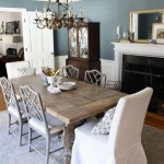
Neutral colors provide a timeless backdrop for any dining room, allowing flexibility in décor and accommodating various design styles. Benjamin Moore's "White Dove" is a popular choice, offering a soft, warm white that brightens the space without feeling stark. "Chantilly Lace" provides a crisper, cooler white for a more modern feel. "Classic Gray" presents a versatile greige option, blending gray and beige for a sophisticated and balanced look. These neutral shades create a canvas for showcasing furniture, artwork, and other decorative elements.
When choosing a neutral, consider the room's natural light. Rooms with ample natural light can handle cooler tones, while rooms with limited light may benefit from warmer shades to prevent a dull appearance. Pairing neutrals with contrasting trim colors can add depth and visual interest to the space.
Rich Jewel Tones
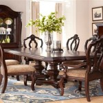
For a more dramatic and intimate dining experience, rich jewel tones can create a luxurious atmosphere. "Hale Navy" offers a deep, saturated blue that evokes a sense of elegance and sophistication. "Hunter Green" brings a touch of nature indoors, creating a calming and grounding environment. "Garnet" provides a bold and vibrant red, perfect for energizing the space and stimulating conversation. Jewel tones are particularly well-suited for dining rooms used for special occasions and evening gatherings.
When using jewel tones, it's crucial to consider the room's size and lighting. Darker colors can make a room feel smaller, so they are best suited for larger dining rooms with ample natural or artificial light. Accentuating jewel-toned walls with metallic finishes in lighting fixtures or decorative accessories can enhance the luxurious feel.
Warm and Inviting Earthy Hues
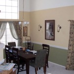
Earthy hues create a welcoming and comfortable atmosphere, ideal for everyday dining and family gatherings. "Edgecomb Gray" offers a warm, understated gray with beige undertones, creating a relaxed and inviting space. "Pale Oak" provides a subtle beige with a hint of gray, perfect for creating a serene and calming backdrop. "Indian River" presents a slightly deeper beige with warmer undertones, adding a touch of richness and depth to the room. These earthy hues work well with natural materials like wood and stone, creating a cohesive and organic feel.
Earthy tones are versatile and adaptable to various lighting conditions. They can brighten a room with limited natural light while also preventing a space with ample sunlight from feeling overly bright. Pairing earthy hues with natural textures in furniture and textiles can further enhance the warm and inviting atmosphere.
Subtle Pastels
Pastel shades offer a light and airy feel, perfect for creating a cheerful and inviting dining room. "Pink Moire" provides a soft and delicate pink, adding a touch of romance and femininity to the space. "Misty Lilac" offers a subtle and calming lavender, creating a tranquil and serene atmosphere. "Celery Green" presents a refreshing and light green, bringing a touch of nature indoors. Pastel shades are particularly well-suited for breakfast nooks and smaller dining areas.
When using pastel shades, consider the overall design aesthetic of the home. These colors work well in spaces with a light and airy feel, complementing soft furnishings and natural light. Pairing pastels with white or light-colored trim can enhance the brightness and airiness of the space.
Bold Accent Colors
Using a bold accent color on one wall can create a focal point and add personality to the dining room. Benjamin Moore's "Caliente" offers a vibrant and energetic red, perfect for creating a statement wall. "Deep Royal Blue" provides a rich and sophisticated blue, adding a touch of drama and elegance to the space. "Raccoon Fur" presents a deep and moody gray, ideal for creating a sense of intimacy and intrigue. Accent walls can be particularly effective in open-plan dining areas, helping to define the space and create visual separation.
When choosing a bold accent color, consider the existing color scheme and the desired mood. The accent color should complement the other colors in the room and create a cohesive look. Balancing a bold accent wall with neutral colors on the other walls can prevent the space from feeling overwhelming.

The Best Beamin Moore Dining Room Paint Colors

12 Dining Room Paint Colours Ideas Inspiration Beamin Moore

12 Dining Room Paint Colors Ideas Inspiration Beamin Moore

Dining Room Ideas And Inspiration

12 Dining Room Paint Colors Ideas Inspiration Beamin Moore

The Best Beamin Moore Dining Room Paint Colors

12 Dining Room Paint Colors Ideas Inspiration Beamin Moore

Guide To Monochromatic Color Schemes Beamin Moore

Dining Room 1 Beamin Moore

Blue Paint Ideas Beamin Moore